With over a decade of experience leading Glance, a development agency that has guided dozens of travel businesses from concept to launch, Anand Naidu has seen firsthand what separates a six-figure success from an abandoned project in the crowded app stores. He joins us today to pull back the curtain on the travel app development lifecycle. We’ll move beyond the buzzwords to discuss the nitty-gritty of validating an idea, the art of cutting features to find the core user value, making critical technology choices without a technical background, and the disciplined approach required to launch and grow an app in a market dominated by giants.
You mentioned a client spent three months just narrowing down their app idea. Can you walk us through the process you use to help founders move from a broad concept like “an app for travelers” to a focused, launch-ready idea that solves a single problem extremely well?
It’s a journey I’ve been on many times, and it always starts with challenging that initial broad vision. When a founder says they want an “app for travelers,” my first question is always, “Which traveler, and what is their single biggest headache?” We had a client who wanted to build an app that did everything—flights, hotels, translations, restaurant tips. It felt like they were trying to boil the ocean. So, we spent those three months not on features, but on defining the user and the problem. We map out the different categories an app can fall into—booking, planning, navigation, discovery—and force a choice. The goal is to find one specific pain point for one specific user group. The mistake isn’t starting small; it’s trying to compete everywhere at once. I often point to a fintech client we worked with. They spent eighteen months perfecting just a currency conversion feature. It sounds incredibly limited, but by doing that one thing flawlessly, they built a foundation of trust that allowed them to expand into a full travel banking app. That’s the model: find a sharp, painful problem and become the absolute best solution for it before you even think about adding anything else.
You highlight analyzing one- and two-star reviews for competitor research. Beyond identifying frustrations like hidden fees or poor offline functionality, how do you systematically turn those raw complaints into a concrete feature roadmap for a new app?
That’s where the real gold is, because those one- and two-star reviews are a pre-made list of what the market desperately wants but isn’t getting. My process for turning that raw anger into a roadmap is quite methodical. First, we download the top twenty competing apps and actually use them for a week—we book things, plan trips, and try to break them. While we’re doing that, we’re also scraping and categorizing hundreds of those negative reviews into themes. You’ll see patterns emerge instantly: “confusing booking flow,” “fees appeared at the last second,” “app was useless without Wi-Fi,” “customer service was a ghost.” Once we have these themes, we reframe them. A complaint like “hidden fees” becomes a core feature for our app: “Upfront, All-Inclusive Pricing.” The frustration of “poor offline functionality” becomes a key selling point: “Your tickets and itinerary, always available offline.” Each major complaint becomes a “painkiller” feature that we prioritize for the first version. It’s not just about avoiding their mistakes; it’s about building your entire value proposition around solving the very problems that make people furious with the current market leaders.
You described a project where 47 features were cut down to just 12 core functions. What is your framework for making those tough “core vs. nice-to-have” decisions, and how do you manage client expectations when stripping away features they believe add value?
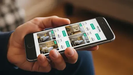
That healthcare app with 47 initial features is a classic example of a project spiraling into chaos before it even begins. My framework is simple: for every single feature on the wishlist, we ask, “Can the user complete their primary goal without this?” For a hotel booking app, the primary goal is to find and book a room. So, search, filter, view details, and book—those are core. Everything else, from loyalty programs to wishlists to city guides, is a nice-to-have for version two. When you frame it that way, the list of essentials becomes brutally short. Managing client expectations is the hardest part. Founders often feel that more features equal more value. I have to shift their perspective by explaining that a dozen features that work perfectly are infinitely more valuable than four dozen that are buggy and confusing. I remind them that you can always add features post-launch based on what real users are asking for, but it’s nearly impossible to take away a feature that people are used to, even if only 2% of them use it. Launching with just those twelve core features made the app clean, fast, and reliable, and users absolutely loved it for what it did, not for what it promised to do someday.
The article contrasts a transport app needing native development for precise GPS with faster cross-platform options. What are the top three technical questions a non-technical founder should ask a development agency to confidently decide between a native or cross-platform build for their specific app idea?
This is a critical decision, and a non-technical founder can feel completely out of their depth. The key is to ask questions about outcomes, not about code. First, I’d advise them to ask: “Based on my core user journey, which approach will deliver the most reliable and performant experience, especially for the most critical feature, like GPS tracking or offline map access?” This forces the agency to justify their choice based on user experience, not just cost or speed. Second, they should ask: “What are the long-term trade-offs? If we choose the faster, cheaper option now, what limitations or extra costs might we face in two years if we need to add more complex features or scale to a million users?” This gets them thinking about total cost of ownership, not just the initial build price. Finally, the most important question is: “Can you show me two apps you’ve built—one native and one cross-platform—and walk me through why that specific choice was the right one for that client’s business goals?” This cuts through the sales pitch. It forces them to demonstrate their strategic thinking and provides concrete proof of their experience, allowing the founder to see the real-world results of each path.
You shared an anecdote about a booking app crashing for stays longer than 14 nights. Beyond standard functional testing, what specific, travel-related “edge cases” like this do you insist on testing to ensure an app is resilient in real-world scenarios, especially regarding offline functionality?
That 14-night booking bug would have been an absolute catastrophe if it had gone live. It taught us that testing for travel apps has to simulate the unique chaos of being on the road. We have a whole checklist of travel-specific edge cases now. A huge one is testing with the device in airplane mode. Can the user still access their boarding pass, their hotel confirmation, their itinerary? If not, the app is fundamentally broken for a traveler. We also rigorously test on slow and unstable networks—what I call the “dodgy hotel Wi-Fi” test—to see how the app performs when connectivity is terrible. Another is testing across different regions, which means checking that the app handles different currencies, date formats, and languages without breaking. We also test on a wide range of physical devices, at least ten different ones, because emulators just don’t catch the performance and battery drain issues that show up on real hardware. We’re essentially trying to replicate the stressful environment of a real trip, where the user is distracted, in a hurry, and dealing with a flaky connection.
You described a tour operator wasting $8,000 on ads because of poor onboarding and retention. What specific user engagement metrics and retention rates should a new app hit before spending on paid acquisition, and how do you advise clients on balancing that budget between marketing and post-launch improvements?
It was painful to watch that tour operator burn through eight grand. They were pouring water into a leaky bucket. Before a client spends a single dollar on paid ads, I need to see a “sticky” product. There isn’t a magic number, but we look for a healthy Day 7 and Day 30 retention rate from their initial organic users. If a significant percentage of users aren’t coming back after the first week, spending money to acquire more is just flushing it down the toilet. We also look at the conversion rate for the app’s core action—how many people who open the app actually complete a booking or create an itinerary? If that’s low, it tells us there’s a fundamental problem in the user flow. My advice is always the same: in the first few months, your budget should be heavily weighted towards post-launch development, not marketing. Use analytics tools to watch where early users get stuck, then spend your money fixing those problems. Once you see those retention and conversion metrics stabilize and improve, that’s the signal that the product is ready. Then, and only then, do you turn on the paid acquisition taps.
Your guide notes that App Store Optimization is crucial from day one. What are the most common ASO mistakes you see travel apps make, and what is your process for crafting a compelling app title, description, and set of screenshots that actually drives downloads?
The most common mistake is treating the app store listing as an afterthought. I see so many apps with generic descriptions and boring, uninformative screenshots. You’re competing with millions of other apps, so you have to sell the solution to the user’s problem before they even hit the download button. Our process is to treat the listing like a landing page. First, we do keyword research to find what users are actually searching for, but we don’t just stuff those keywords in. We craft an app title that is both descriptive and aspirational. The description needs to tell a story: open with the pain point you solve, then clearly explain how your top three features make the user’s life easier. For screenshots, the biggest mistake is just showing random screens. Instead, we design them to be a mini-tutorial. Each screenshot should have a bold headline explaining the benefit (“Find Eco-Friendly Stays Instantly”), with the relevant part of the UI highlighted. It’s about showing the app in the context of solving a real problem, which is far more compelling than a list of features.
What is your forecast for the travel tech space over the next five years, especially for startups trying to find a niche against established giants?
My forecast is that the era of the all-in-one travel “super app” is largely over for startups. You can’t out-Booking Booking.com. The future, and the real opportunity, lies in hyper-specialization. The successful new travel apps will be the ones that solve one specific problem for one specific community better than anyone else. We’re already seeing this with apps focused purely on sustainable travel for eco-conscious users, or apps that cater exclusively to digital nomads or families with young children. The giants are a mile wide and an inch deep; startups can succeed by being an inch wide and a mile deep. Technology will enable more personalized and context-aware experiences, but the winning strategy won’t be about having the fanciest tech. It will be about building a deep, trusted relationship with an underserved niche and relentlessly improving the product based on their unique needs. The startups that thrive will be the ones that feel less like a generic tool and more like an indispensable companion for a particular kind of journey.


