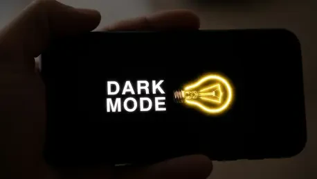

Spending months meticulously crafting a mobile application, with every color and button placement tested for perfection, only to have users complain about a glaringly bright interface at night is a common and frustrating scenario for many developers. Dark mode has transcended its status as a fleeting trend to become a fundamental user expectation, prized for its reduced eye strain, battery-saving benefits on OLED screens, and sleek, modern aesthetic. However, implementing it effectively is far more complex than simply inverting colors or applying a dark background to an existing UI. A poorly executed dark mode can render an application amateurish or, in the worst-case scenario, completely unusable in low-light environments. The most significant error is treating dark mode as an afterthought rather than integrating it into the core design strategy from the project’s inception. A successful implementation requires a holistic approach that considers color theory, technical architecture, and extensive testing. This guide provides a comprehensive walkthrough of the entire process, from initial planning to final deployment, equipping developers with the knowledge to build a dark mode that users will genuinely appreciate rather than merely tolerate.
1. The Significance of a Well Crafted Dark Mode
The demand for dark mode has solidified its place as a standard feature in modern application design, driven by a combination of practical benefits and aesthetic preferences that significantly impact the user experience. One of the primary advantages is the reduction of eye strain, particularly during nighttime use or in dimly lit spaces. The harsh contrast of black text on a bright white background can cause discomfort and fatigue over extended periods. A well-designed dark theme, which utilizes light-colored text on a dark gray background, minimizes this effect by emitting less light, creating a more comfortable viewing experience. Furthermore, for devices equipped with OLED or AMOLED screens, dark mode offers tangible battery life improvements. Unlike LCD panels that illuminate the entire screen regardless of the content, OLED displays can turn off individual pixels to render true black. This means that an interface with large areas of black or very dark colors consumes less power, extending the device’s battery life—a benefit that users consistently value.
Beyond its functional advantages, dark mode contributes significantly to an application’s perceived quality and accessibility. The aesthetic appeal of a dark theme is undeniable; it often imparts a premium, sophisticated feel that makes visual content, such as photos and videos, appear more vibrant and immersive. This modern look can elevate a brand’s image and align it with contemporary design trends. More importantly, a thoughtfully implemented dark mode is a crucial component of inclusive design. For users with certain visual impairments, such as photophobia (light sensitivity) or cataracts, a dark interface can be substantially more legible and comfortable to use than a traditional light one. By providing this option, developers make their applications accessible to a broader audience. Conversely, a poorly executed dark mode with low-contrast text or clashing colors can actually hinder accessibility and reflect poorly on the brand, suggesting a lack of attention to detail and a disregard for user needs. Therefore, a properly crafted dark mode is not just a cosmetic feature but a reflection of a commitment to user-centric design and overall product quality.
2. Formulating Your Dark Mode Strategy
Before any code is written or colors are selected, a robust strategy must be established, treating dark mode as an integral part of the design process rather than a feature to be tacked on later. The foundation of this strategy is a deep understanding of user context. Developers must consider who will be using the dark mode feature and under what circumstances. Are the primary users individuals who browse content late at night, professionals working in low-light environments, or users who prefer dark mode permanently for aesthetic or accessibility reasons? Answering these questions helps shape the entire design approach, preventing decisions that may look good in a design tool but fail in real-world scenarios. For example, a theme designed for nighttime reading should prioritize minimal contrast and muted accent colors to avoid startling the user, whereas a theme for permanent use needs to ensure that all interactive elements are clearly distinguishable in various lighting conditions, including bright daylight.
Central to a successful strategy is the principle of maintaining a consistent and usable experience across both light and dark themes. The application’s core identity, including its branding, typography, and information hierarchy, must remain intact. Navigation patterns, button sizes, spacing, and other fundamental UI components should be identical, with only the color palette changing. The common pitfall of simply inverting colors often leads to a disastrous user experience, as it can break visual cues, render important information illegible, and create a jarring transition that disrupts user flow. To avoid this, the design process must include rigorous testing with actual users in realistic lighting conditions. What appears perfectly balanced on a designer’s high-resolution monitor in a well-lit office can become a mess of indistinguishable gray shapes on a smartphone screen in a dimly lit room or under direct sunlight. Planning for this from the outset ensures the transition between modes feels seamless and natural, reinforcing the sense that it is one cohesive application, thoughtfully designed for all environments.
3. Developing Your Dark Mode Color Palette
Constructing an effective dark mode color palette is a nuanced task that extends far beyond choosing black and white. One of the most common and detrimental mistakes is using pure black (#000000) for the primary background. While it may seem like the most logical choice, a pure black background creates extreme contrast with light text, which can lead to a phenomenon known as halation, where text appears to glow or bleed into the background, causing significant eye strain. A more effective approach is to use dark gray as the base color, with shades like #121212 or #1a1a1a serving as excellent starting points. These near-black tones reduce the overall brightness and soften the contrast, making the interface more comfortable for prolonged viewing. Similarly, pure white (#FFFFFF) should be avoided for text. Its starkness against a dark background can be just as jarring. Instead, using an off-white or light gray, such as #e0e0e0, provides sufficient readability without being overly harsh. This subtle shift in shades is the key to creating a dark theme that feels balanced and professional.
After establishing the base background and text colors, the next critical step is to ensure that the entire palette adheres to accessibility standards and creates a clear visual hierarchy. The Web Content Accessibility Guidelines (WCAG) recommend a minimum contrast ratio of 4.5:1 for normal-sized text and 3:1 for larger text. These ratios are not arbitrary; they are essential for ensuring that users with moderate visual impairments can read the content comfortably. Developers should use online contrast-checking tools to verify that all color combinations meet these standards. Beyond the primary text, the palette must also account for accent colors used for buttons, links, and other interactive elements. These colors need to be vibrant enough to stand out against the dark background but not so saturated that they become distracting or cause visual fatigue. It is also important to test the palette under a variety of real-world conditions. A color that provides adequate contrast in a dark room might become completely unreadable on a phone screen in bright sunlight. Thoroughly testing the full range of colors across different devices and lighting environments is the only way to guarantee a universally usable and visually pleasing dark mode.
4. Technical Execution of Dark Mode
With a solid design and color palette in place, the focus shifts to technical implementation, where modern development frameworks offer powerful tools to streamline the process. For native iOS development, the most effective approach is to leverage Apple’s built-in UIUserInterfaceStyle system. This framework automatically detects whether the user has enabled dark mode at the system level and adjusts the application’s appearance accordingly. The key to making this work seamlessly is the use of semantic colors rather than hardcoded hex values. Instead of defining a background color as #FFFFFF, a developer would use UIColor.systemBackground. This semantic color automatically resolves to a light color in light mode and a dark color in dark mode. Similarly, UIColor.label and UIColor.secondaryLabel adapt for text, ensuring readability across both themes. By adopting this semantic approach, developers create a robust and future-proof implementation that will continue to work correctly with future iOS updates, minimizing long-term maintenance.
On the Android platform, the implementation strategy revolves around the AppCompatDelegate.MODE_NIGHT system and resource qualifiers. The recommended practice is to create separate resource folders for light and dark themes. The default colors are defined in the res/values/colors.xml file, while the dark theme overrides are placed in a corresponding file within the res/values-night/ directory. When the system theme changes, the Android OS automatically selects the appropriate color resources without requiring any manual intervention in the application’s code. For cross-platform development with frameworks like React Native or Flutter, similar abstractions are available. React Native provides the Appearance API and the useColorScheme hook to detect the current system theme, allowing components to style themselves accordingly. Flutter’s ThemeData class enables developers to define both a light theme and a darkTheme at the application’s root, with widgets throughout the app referencing these theme properties instead of hardcoded values. In all of these platforms, the guiding principle is the same: abstract color definitions into a centralized theme system and avoid hardcoding them directly in UI components. This discipline not only simplifies the initial implementation but also makes future updates and brand refreshes significantly easier to manage.
5. Verifying Dark Mode Across Diverse Devices
Building a dark mode that looks perfect on a development machine is only the beginning; the true measure of success comes from its performance in the hands of real users on their own devices. Rigorous testing across a wide range of hardware is non-negotiable because screen technology and calibration vary dramatically between manufacturers. For example, Samsung’s AMOLED displays are known for their high saturation, which can make carefully chosen dark grays appear as pure black and subtle accent colors look overly vibrant. In contrast, an iPhone’s display might render the same colors more neutrally. Without testing on both, a design optimized for one platform may appear unbalanced or even broken on another. This variance is not a flaw but a reality of the mobile ecosystem that developers must account for.
The type of screen technology is another critical factor. OLED and AMOLED screens save battery in dark mode because they can turn off individual pixels to display true black. However, this can sometimes lead to an issue known as “black smear” or “ghosting,” where moving UI elements or scrolling text leave a faint trail on a pure black background. On the other hand, LCD screens, common in more budget-friendly devices, require a backlight that is always on, meaning that “black” is actually a very dark gray. A design that relies on subtle differences in dark shades to create depth might lose its intended effect on an LCD panel. Furthermore, testing must extend beyond the device itself to encompass environmental factors. An interface that is perfectly legible indoors can become an unreadable, reflective surface in direct sunlight. Developers must test their applications at various brightness levels, from the dimmest setting in a dark room to the brightest setting outdoors. Simulators and emulators are useful for initial checks, but they cannot replicate these real-world conditions. The only way to ensure a robust and reliable dark mode is to test it on a physical device lab that includes a representative sample of popular devices, screen types, and operating system versions.
6. Managing User Settings for Dark Mode
A technically sound dark mode implementation is incomplete without providing users with intuitive and comprehensive control over their experience. The placement and clarity of dark mode settings are paramount to user satisfaction. These options should be easy to find, typically residing within the application’s main settings or display menu, where users instinctively look for such controls. Hiding the toggle in an obscure submenu or an unexpected location will only lead to frustration. The golden rule is to prioritize discoverability and simplicity. Once located, the options presented to the user should be clear and cover all common use cases. At a minimum, an application should offer three choices: a permanent “Light” mode, a permanent “Dark” mode, and a “System Default” option that automatically syncs the app’s theme with the device’s global setting.
To deliver a truly premium experience, developers should consider offering more advanced control, such as an automatic scheduling option. This feature, which can switch the theme based on the time of day or local sunrise and sunset times, provides a magical, “just works” experience that users deeply appreciate. It removes the manual effort of toggling the theme, allowing the app to adapt seamlessly to the user’s environment. Equally important is the persistence of the user’s choice. Nothing is more irritating than having to re-apply a preferred setting every time an app is launched. The selected theme preference must be stored locally on the device and, for applications with user accounts, synced across all of the user’s logged-in devices. This ensures a consistent experience whether they open the app on their phone, tablet, or any other platform. By giving users granular control and respecting their choices, developers demonstrate a commitment to user-centric design that builds loyalty and enhances the overall perception of the application.
7. A Polished and Professional Finish
The successful implementation of dark mode was a process that went far beyond a simple inversion of colors. It began with a strategic decision to treat the feature as a core component of the user experience, not as an afterthought. Through careful planning, a dedicated color palette was developed that prioritized readability and visual comfort, avoiding the harsh contrasts of pure black and white in favor of a more nuanced spectrum of dark grays and off-whites. The technical execution relied on native, system-level frameworks, which ensured that the application would adapt seamlessly to user preferences and remain compatible with future operating system updates. This disciplined approach of abstracting theme logic away from individual components resulted in a cleaner, more maintainable codebase.
Ultimately, the most critical phase was the rigorous testing conducted across a diverse range of physical devices. This revealed subtle but significant differences in how various screen technologies and manufacturer calibrations rendered the interface, allowing for fine-tuning that would have been impossible with simulators alone. By testing in different real-world lighting conditions, from dimly lit rooms to bright outdoor sunlight, the final design was validated as robust and universally usable. The inclusion of comprehensive user controls, allowing for manual selection, system synchronization, and automatic scheduling, empowered users and demonstrated a deep commitment to their experience. The result of this methodical effort was not just a visually appealing dark theme but a more polished, professional, and accessible application that strengthened user trust and satisfaction.