

The digital landscape is no longer a static canvas but a dynamic ecosystem of interconnected experiences, demanding interfaces that are not just functional but are intuitively woven into the fabric of a user’s context. As development teams look ahead, a clear consensus is emerging around a set of architectural patterns and design philosophies poised to define the next generation of user interfaces. These are not fleeting trends but foundational shifts that address the growing complexity of modern applications, the need for scalable and maintainable codebases, and the ever-increasing expectations of users for seamless, intelligent interactions. This collection of insights reflects the collective wisdom of the frontend community, highlighting the dominant strategies that will shape how digital products are conceived, built, and experienced.
Setting the Stage Why Tomorrows Interfaces Are Being Architected Today
The groundwork for the next era of digital interaction is being laid not in futuristic concepts but in the practical, architectural decisions made by developers today. There is a widespread recognition that frontend development has matured beyond simply translating static designs into code. Instead, it has become a discipline of system architecture, where the primary goal is to build resilient, adaptable, and scalable user interfaces. This shift in perspective is driven by the sheer complexity of modern applications, which must perform flawlessly across an ever-expanding array of devices, contexts, and user needs. The patterns gaining traction are those that prioritize long-term maintainability and team velocity over short-term implementation speed, establishing a robust foundation that can evolve without collapsing under its own weight.
This architectural mindset is a direct response to the lessons learned from the rapid, often chaotic, growth of the web over the past decade. Many organizations are grappling with technical debt accumulated from monolithic frontend codebases that are difficult to update and prone to regressions. Consequently, industry leaders are championing a move toward more structured, modular approaches. The emphasis is on creating systems, not just pages. This involves establishing clear contracts between different parts of the UI, ensuring that components are self-contained and reusable, and building a development culture that values consistency and shared standards. The prevailing view is that investing in this upfront architectural rigor pays significant dividends, enabling teams to build more complex features faster and with greater confidence in the years to come.
The Core Shifts Reshaping Digital Interaction
The Rise of Composable Architecture From Atomic Design to Reactive State
A foundational principle that has gained universal acceptance is that of component-driven development, with the Atomic Design methodology serving as its most influential blueprint. This approach, which advocates for breaking interfaces down into their smallest constituent parts—atoms, molecules, and organisms—is now considered standard practice for building scalable UI systems. Industry analyses consistently show that teams adopting this methodology see tangible benefits, including significant reductions in development time and marked improvements in design consistency across large-scale applications. The power of this pattern lies in its creation of a shared, hierarchical language that bridges the gap between design and engineering, allowing teams to discuss and build complex interfaces with a common understanding of their structure. This modularity ensures that individual components can be developed, tested, and updated in isolation, dramatically reducing the complexity of the system as a whole.
Alongside the structural organization of components, the management of application state has been a subject of intense debate and innovation. The current discourse centers on two dominant patterns: the established Context API and the increasingly popular paradigm of Signals. The Context API remains a go-to solution for propagating global state through a component tree without the tediousness of “prop drilling,” proving its worth in applications with simpler state requirements. However, a growing number of developers are turning to Signals for their promise of fine-grained reactivity and superior rendering performance. Signals offer a more efficient way to track state changes, ensuring that only the specific components that depend on a piece of state are re-rendered when it updates. The expert consensus advises a pragmatic approach: start with local state as the default and escalate to a global solution like Context or Signals only when necessary, choosing the pattern that best aligns with the application’s specific performance and complexity needs.
Beyond the Viewport How Context Aware Layouts Are Redefining Responsiveness
The conversation around responsive design has evolved significantly, moving beyond the limitations of viewport-based media queries toward more sophisticated, context-aware solutions. The most transformative development in this area is the widespread adoption of container queries. For years, developers faced the challenge of creating components that needed to adapt their layout based on the space they were allocated, not the size of the entire screen. Container queries directly solve this problem, allowing a component to respond to the dimensions of its parent container. This is a paradigm shift for creating truly modular and reusable components. An element, such as a product card, can now have a single, intelligent design that seamlessly adapts whether it is placed in a narrow sidebar, a wide main content area, or a modal dialog, without requiring duplicative CSS or complex JavaScript logic.
This move toward contextual layouts extends to typography as well. While viewport units offered an initial solution for fluidly scaling text, their inability to respect user-set font sizes raised significant accessibility concerns. The modern, preferred approach combines the power of the CSS clamp() function with relative units like rem. This technique allows developers to define a minimum font size, an ideal size that scales with the viewport, and a maximum size, ensuring text is always legible without becoming overwhelmingly large on wide screens. More importantly, because it is rooted in rem units, this method respects a user’s browser-level font size settings, striking a critical balance between responsive design and accessibility. This nuanced approach to fluid typography is now seen as a hallmark of professional, user-centric frontend development.
Industrializing UI Development The Synergy of Shared Libraries and Inclusive Design
The creation and maintenance of design systems have transitioned from a niche practice to a core tenet of modern product development, effectively industrializing the process of building user interfaces. At the heart of this movement is the establishment of a shared design language, often codified within tools like Figma. This language goes beyond simple color palettes and font choices; it encompasses spacing, motion, tone, and interaction patterns, creating a unified and coherent user experience across an entire product suite. Experts emphasize the importance of using semantic naming conventions for design tokens—for instance, color-action-primary instead of blue-500—to ensure the language is meaningful and technology-agnostic. This shared vocabulary becomes the single source of truth, fostering seamless collaboration between designers and developers and drastically reducing inconsistencies and misinterpretations.
This design language is brought to life through component libraries, with tools like Storybook emerging as the industry-standard workshop for building, testing, and documenting UI components in isolation. This practice, known as Component-Driven Development (CDD), enables teams to perfect each piece of the UI without the complexities of the surrounding application logic. The result is a collection of robust, battle-tested components that can be composed to build complex screens with speed and confidence. A crucial aspect of this industrialization is the integration of accessibility from the very beginning. The prevailing best practice is to build accessibility directly into the shared components, ensuring that every button, input, and modal is perceivable, operable, understandable, and robust. By embedding ARIA roles and semantic HTML into the library, teams make inclusivity a default feature rather than an afterthought, creating more equitable digital experiences at scale.
Intelligent and Efficient Weaving AI and Performance Optimization into the Development Fabric
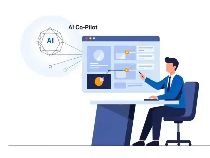
Artificial intelligence is rapidly evolving from a futuristic concept into a practical tool integrated directly into the frontend development workflow. Leading design platforms are now embedding AI-powered features that offer intelligent layout suggestions, automate the creation of design variations, and even generate entire prototypes from simple text prompts. These tools act as collaborators, augmenting the designer’s creativity rather than replacing it. This synergy allows for rapid exploration of ideas and significantly shortens the path from initial concept to a tangible design. The impact of this is a dramatic increase in efficiency, with some reports indicating a reduction of up to 80% in the time it takes to move from a design concept to a functional prototype.
This AI-driven acceleration extends into the development phase, with a new generation of plugins capable of generating high-quality, production-ready code directly from design files. These tools analyze the layers, styles, and layouts in a Figma design and translate them into corresponding HTML, CSS, and component-based JavaScript. While the generated code often requires refinement and integration by a developer, it eliminates a significant portion of the tedious manual work involved in translating a visual design into a functional interface. Simultaneously, performance optimization remains a paramount concern. Patterns like lazy loading and code splitting are now considered non-negotiable for any modern web application. By deferring the loading of non-critical components and splitting the application into smaller, on-demand chunks, developers can drastically improve initial page load times, which is a critical factor for user retention and satisfaction. Complementing this, techniques like tree shaking, which automatically eliminates unused code from the final bundle, ensure that applications are as lean and efficient as possible.
Blueprint for the Future Actionable Strategies for Tomorrows Developer
The convergence of these core shifts provides a clear blueprint for developers aiming to build the resilient and engaging interfaces of tomorrow. The overarching strategy is one of intentional system design, where every decision is weighed against its impact on scalability, maintainability, and user experience. It requires a holistic view that connects the dots between a composable component architecture, a context-aware layout system, an industrialized design-to-code pipeline, and an unwavering commitment to performance and accessibility. Adopting this blueprint means moving away from ad-hoc development and toward a more disciplined, engineering-focused practice.
Implementing this strategy in practice involves several key actions. First is the adoption of a component-first mentality, where applications are conceived as a collection of well-defined, reusable parts. This must be supported by a robust state management strategy tailored to the application’s complexity. Second is mastering modern CSS layout techniques, particularly container queries, to create truly adaptive components. Finally, developers must embrace the new wave of AI-assisted tools to automate repetitive tasks and focus their energy on solving complex, unique problems, all while ensuring the final product is performant and accessible to all users. These are the actionable pillars upon which the next generation of frontend applications will be built.
The Enduring Principles of Next Generation Frontend Development
Looking back at the trajectory of frontend development, a set of enduring principles emerged that underpinned the most successful and resilient digital products. The most fundamental of these was the principle of composition. The widespread adoption of component-driven methodologies, guided by philosophies like Atomic Design, fundamentally altered how interfaces were constructed. This shift from monolithic pages to a system of interconnected, reusable elements proved critical for managing the complexity of modern applications and enabling teams to scale their efforts effectively. State management strategies also matured, with a clear consensus forming around choosing tools like Signals or the Context API based on a pragmatic assessment of an application’s specific needs for reactivity and performance.
Another key principle that solidified its importance was context awareness. The limitations of viewport-centric responsive design gave way to more nuanced approaches that allowed components to adapt intelligently to their immediate environment. The rise of container queries was a watershed moment, finally providing a pure CSS solution to a problem developers had grappled with for nearly a decade. This was complemented by sophisticated typography techniques that ensured readability and accessibility across all screen sizes. This focus on context extended to user interaction, with a renewed emphasis on building touch-optimized interfaces that respected the ergonomics of mobile devices, creating experiences that felt natural and intuitive.
Finally, the industrialization of the UI development process cemented itself as a core principle for professional teams. The synergy between shared design systems, component libraries, and automated tooling created a powerful engine for consistency and efficiency. This systematic approach was not just about speed; it was about quality. By embedding accessibility standards directly into shared component libraries, teams elevated inclusive design from a compliance checkbox to a foundational element of the user experience. The integration of AI into the workflow further streamlined this process, automating rote tasks and empowering developers to focus on higher-level architectural challenges. These principles—composition, context awareness, and industrialization—were the cornerstones that defined a more mature, robust, and user-centric era of frontend development.